Viewport, custom CSS, fonts
Running a web server (optional)
When creating basic static web sites, it’s entirely possible to test them in your browser just using a file:// URL. That’s what you get when you just select a .html file on your disk and select “Open with…” then a browser. (So the same file is open in your editor and in your browser.)
But as we start using Javascript and other features, it can be helpful to load the pages and linked resources through an actual HTTP connection. Another use case where this helps is if you want to edit on one device (laptop) and view on another (smartphone).
There are several ways to run a web server on your development machine, but one of the simplest is to use Python. On a Mac, you probably already have Python installed. On Windows, it’s easy to install – just make sure in the installation that you enable the checkbox which says “Add to PATH”.
Your Python executable is probably called one of python or python2 or python3. Figure out which ones work by trying these commands:
python --version
python2 --version
python3 --version
As long as one of those succeeds, we should be alright. If you have one which reports version “3.something” then here’s the command you need to run the web server (substitute your working python command):
python -m http.serverIf instead you have a version “2.something”, the command is slightly different:
python -m SimpleHTTPServerThe output will be something like:
Serving HTTP on 0.0.0.0 port 8000 ...Next you just need to know the IP address of your laptop, where you’re running this command. Check your network settings or run ipconfig (Windows) or ifconfig (Mac) in another terminal.
On another device, you’ll be able to access the web server at http://IP_ADDRESS:8000/FILENAME.html where you substitute the capitalized portions of that URL appropriately.
Security warning: This technique exposes all files within the directory you’re running (and subdirectories) to anyone on your network. So make sure you’re in an isolated directory where the only thing there is to see is the web site you’re working on!
Firewall note: If you are running a Firewall on your laptop, then this connection probably won’t work. You’ll have to configure port 8000 to be allowed through the firewall, or (perhaps temporarily) disable the firewall to connect.
Mobile viewport header
When we used the above technique to access the Bootstrap demo page we created in the previous notes from a smartphone, we noticed that it wasn’t adapting to the smaller screen size:
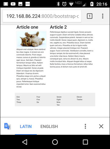
Bootstrap demo on smartphone browser
By default, mobile browsers pretend they have a full desktop screen size, and show that version of the site, but zoomed way out. This makes the text hard to read, although the user can pinch and double-tap to zoom the view in on particular blocks of text.
This behavior is in spite of the fact that Bootstrap does support collapsing columns, as we saw when we adjust the size of the browser window on a desktop.
To get the mobile browser to act as a true mobile screen size, you need to add a viewport declaration to your page. It looks like this, and goes in the <head> section:
<meta name="viewport" content="width=device-width, initial-scale=1.0">With that one line added, now the mobile browser displays the same content formatted as a mobile web site:
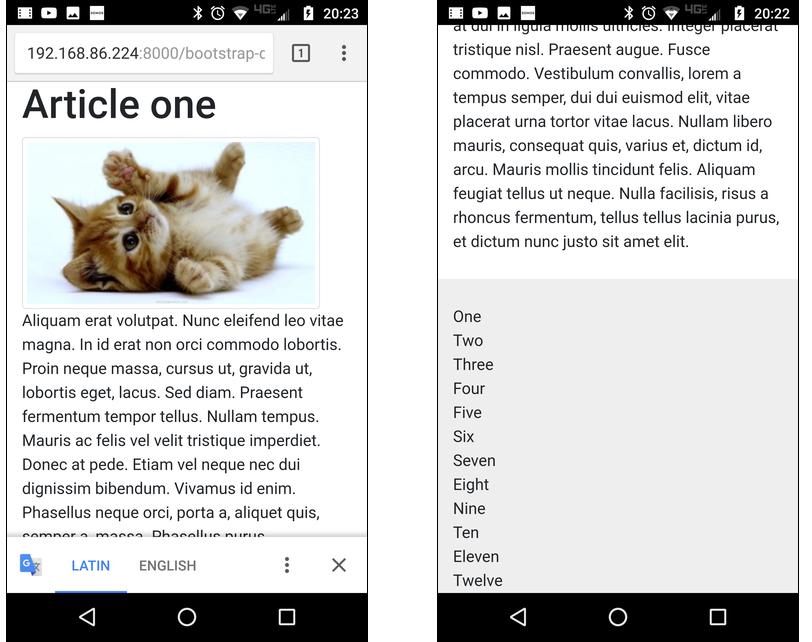
Top and bottom of bootstrap-demo with viewport setting
Custom CSS and selector syntax
After the link tag that fetches the bootstrap.min.css, we can still add a custom CSS style block, like this:
<style type="text/css">
  h1 {
    text-align: center;
    color: #373;
  }
</style>
Above, we’re using a selector based only on the name of an element – in this case the h1 element. But what if we want to distinguish particular h1 elements, or subsets of them?
The best way is to mark those h1 elements with a class or id attribute. For example, we could create <h1 class="important"> and then match it with a rule like this:
      h1.important {
        border-bottom: 1px solid blue;
        background: #fee;
        font-style: italic;
      }
The dot in the selector syntax, h1.important means that it applies to all h1 elements that have a class of important. (The name important doesn’t have any special meaning in CSS, it’s just an identifier – we could have used class="susan" and h1.susan for the same effect.)
The id attribute can be used similarly, except the intention is that there is only one element with any particular id – it should be a unique identifier. The syntax for an id-based selector uses a hash sign: h1#winner to match <h1 id="winner">:
      h1#winner {
        color: #337;
      }
There are lots of other capabilities in the selector syntax. You can use spaces to indicate descendants (children and their children), so that div.row p.warning matches an element with <p class="warning"> but only if it’s within a <div class="row">.
There are also selector predicates marked with colons. Two that I demonstrated in class were :first-child and :hover. You can see those in action in the complete sample page, but here are the CSS rules:
      div.links :first-child {
        text-align: center;
        font-weight: bold;
      }
      div.link:hover {
        background: #555;
        color: yellow;
      }
On the sample page, try hovering your mouse over the items in the footer.
Google fonts
Customizing the fonts on your page can be tricky because you don’t know what fonts the user has installed on their system. You specify them with the CSS font-family attribute, which can take a list of families and apply the first one that is available, like this:
  body {
    font-family: "Chicago", "Minion Pro", "Times Roman", serif;
  }
The last element in that list is a fallback – there are certain generic family names that are guaranteed to be defined: serif, sans-serif, monospace, cursive, etc.
Rather than relying on fonts installed on the user’s system, it may be preferable to load a custom font from the page. There are different services for this, but perhaps the simplest and cheapest is Google fonts.
You select some fonts from that page and add them to your ‘cart’. Then from the cart you can get a link that you’d paste into your page <head> and your CSS <style> block. On the example page, I used “EB Garamond” and “Pacifico” like this:
<link href="https://fonts.googleapis.com/css?family=EB+Garamond|Pacifico" rel="stylesheet"> body {
font-family: 'EB Garamond', serif;
}
h1 {
font-family: 'Pacifico', cursive;
}Complete example
Here is the modified bootstrap demo code using all the features above. The live version is here.
<html>
  <head>
    <meta name="viewport" content="width=device-width, initial-scale=1.0">
    <link rel="stylesheet"
          href="https://maxcdn.bootstrapcdn.com/bootstrap/4.0.0/css/bootstrap.min.css"
          integrity="sha384-Gn5384xqQ1aoWXA+058RXPxPg6fy4IWvTNh0E263XmFcJlSAwiGgFAW/dAiS6JXm"
          crossorigin="anonymous">
    <link href="https://fonts.googleapis.com/css?family=EB+Garamond|Pacifico" rel="stylesheet">
    <style type="text/css">
      body {
        font-family: 'EB Garamond', serif;
      }
      h1 {
        font-family: 'Pacifico', cursive;
        text-align: center;
        color: #373;
      }
      h1.important {
        border-bottom: 1px solid blue;
        background: #fee;
        font-style: italic;
      }
      h1#winner {
        color: #337;
      }
      div.links :first-child {
        text-align: center;
        font-weight: bold;
      }
      div.link:hover {
        background: #555;
        color: yellow;
      }
    </style>
  </head>
  <body>
    <div class="container" style="">
      <div class="row">
        <div class="col-md-5">
          <h1 id="winner">Article one</h1>
          <img class="img-fluid img-thumbnail" src="cats-animals-kittens-background-us.jpg">

          <p>
          Aliquam erat volutpat. Nunc eleifend leo vitae magna. In id
          erat non orci commodo lobortis. Proin neque massa, cursus
          ut, gravida ut, lobortis eget, lacus. Sed diam. Praesent
          fermentum tempor tellus. Nullam tempus. Mauris ac felis vel
          velit tristique imperdiet. Donec at pede. Etiam vel neque
          nec dui dignissim bibendum. Vivamus id enim. Phasellus neque
          orci, porta a, aliquet quis, semper a, massa. Phasellus
          purus. Pellentesque tristique imperdiet tortor. Nam euismod
          tellus id erat.
          </p>
        </div>
        <div class="col-md-7">
          <h1 class="important">Article 2</h1>
          Pellentesque dapibus suscipit ligula. Donec posuere augue in
          quam. Etiam vel tortor sodales tellus ultricies commodo.
          Suspendisse potenti. Aenean in sem ac leo mollis blandit.
          Donec neque quam, dignissim in, mollis nec, sagittis eu,
          wisi. Phasellus lacus. Etiam laoreet quam sed arcu.
          Phasellus at dui in ligula mollis ultricies. Integer
          placerat tristique nisl. Praesent augue. Fusce commodo.
          Vestibulum convallis, lorem a tempus semper, dui dui euismod
          elit, vitae placerat urna tortor vitae lacus. Nullam libero
          mauris, consequat quis, varius et, dictum id, arcu. Mauris
          mollis tincidunt felis. Aliquam feugiat tellus ut neque.
          Nulla facilisis, risus a rhoncus fermentum, tellus tellus
          lacinia purus, et dictum nunc justo sit amet elit.

        </div> <!-- col -->
      </div>   <!-- row -->

      <div class="row" style="margin-top: 3ex; padding-top: 3ex; background-color: #eee">
        <div class="links col-md-3">
          <div class="link">One</div>
          <div class="link">Two</div>
          <div class="link">Three</div>
        </div>
        <div class="links col-md-3">
          <div class="link">Four</div>
          <div class="link">Five</div>
          <div class="link">Six</div>
        </div>
        <div class="links col-md-3">
          <div class="link">Seven</div>
          <div class="link">Eight</div>
          <div class="link">Nine</div>
          <div class="link">Ten</div>
        </div>
        <div class="links col-md-3">
          <div class="link">Eleven</div>
          <div class="link">Twelve</div>
        </div>
      </div> <!-- row -->


    </div>     <!-- container -->

  </body>
</html>
PDF
PDF