Validation and CSS properties
30 January 2019 
1 W3C validator
HTML has a particular syntax, and expectations about which tags can be used within other tags, what attributes are valid with which tags, whether to expect closing tags, etc.
Generally browsers make a “best effort” to render whatever they’re given, even if it’s full of errors. This can be helpful – if small mistakes produce reasonable content in all the major browsers, then many web devs are satisfied with that.
However, sometimes mistakes do cause problems that show up later, or with a new release of a browser, or just in a particular context. So it’s still a best practice in some environments to ensure our HTML and CSS are free of errors.
There’s an online validator that you can point to a web page, or upload a file, or just paste some HTML. But a more convenient way to use it is as a command-line tool or integrated with your editor.
I packaged the W3C validator for our VM. You can run it from a
terminal as vnu FILENAME.html. It can take several files at once;
each line of output distinguishes which file contains the error. You
can also use a wildcard, like vnu *.html to check all the files in
the current directory.
Here is an example of a small HTML page and the output from the validator:
<html>
  <head>
    <link rel="stylesheet" src="style.css">
  <p>Hello, world!
</html>
:1.1-1.6: error: Start tag seen without seeing a doctype first.
Expected “<!DOCTYPE html>”.
:3.5-3.43: error: Attribute “src” not allowed on element
“link” at this point.
:3.5-3.43: error: Element “link” is missing one or more of
the following attributes: “href”, “resource”.
:4.3-4.5: error: Element “head” is missing a required
instance of child element “title”.
:1.1-1.6: info warning: Consider adding a “lang” attribute
to the “html” start tag to declare the language of this
document.
The errors on line 3 in particular point to a very important problem,
so the tool may help me understand why perhaps my style sheet isn’t
being applied properly. The <link> tag is expected to have an
attribute href, but I used src instead. I’ll fix that, add the
doctype declaration, and try again:
<!DOCTYPE html>
<html lang="en">
  <head>
    <title>My page</title>
    <link rel="stylesheet" href="style.css">
  <p>Hello, world!
</html>
✓ valid HTML
Now the document validates just fine. Notice that it’s still not
actually as clean as we might like – the <head> and <p> tags are
never closed. It would be preferable to close them. But HTML5 actually
allows some flexibility on that – essentially, the <p> implicitly
ends the <head> section if you forgot to, and the closing </html>
also closes the <p>.
We still can trigger errors along those lines though, by closing the wrong tag first:
<!DOCTYPE html>
<html lang="en">
  <head>
    <title>My page</title>
  <p><b>Hello, <i>world!</b></i>
</html>
:5.25-5.28: error: End tag “b” violates nesting rules.
:5.29-5.32: error: No “i” element in scope but a “i”
end tag seen.
2 Lorem ipsum
This term refers to a collection of quasi-Latin phrases that are used in both printing and web industries as placeholder text while developing a layout and design. There’s an online generator or you can configure your editor to produce it.
If you have an up-to-date VM configuration (run liucs-version to
find out), I have already included the lorem package for Atom.
Insert it by hitting Alt-l or open the Atom Command Palette with
Ctrl-Shift-P and type lorem.

3 CSS measurement units
- px
- pixels, roughly corresponds to device pixels, but subject to
zoom factors (
Ctrl-plus/Ctrl-minus) - %
- a percentage of dimensions of the “parent” container. Does not scale with the zoom factor, but does scale with changes to browser dimensions or orientation (portrait/landscape)
- em
- width of a lowercase
min the current font. Scales with the size of the font in different elements. So if padding is specified as3em, that will be more pixels in headings (which presumable have larger fonts) than in regular paragraphs. - ex
- height of a lowercase
xin the current font. Similarly, scales with the size of the font.
There are several other units, but they are not so widely used.
4 CSS box model
The box model refers in part to a set of nested rectangles induced by each tag. From the inside out, they represent the content, padding, border, and margin.
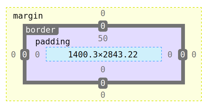
You can independently alter the measurements of each box in each
direction. They correspond to properties named like margin-left,
padding-bottom, or border-right-width. But you can also leave out
the direction in those properties and instead specify 1, 2, or 4
numbers.
- If there is 1 measurement, it is applied in all four directions.
- If there are 2 measurements, the first is vertical (top and bottom) and the second is horizontal (left and right).
- If there are 4 measurements, they are applied in the order top, right, bottom, left (remember it as clockwise).
5 Browser dev tools
In Firefox, if you right-click anywhere on a page, you can select Inspect. It will bring up a tool panel as shown below. (Chrome, Safari, and other browsers have similar tools, but we will focus on Firefox.)
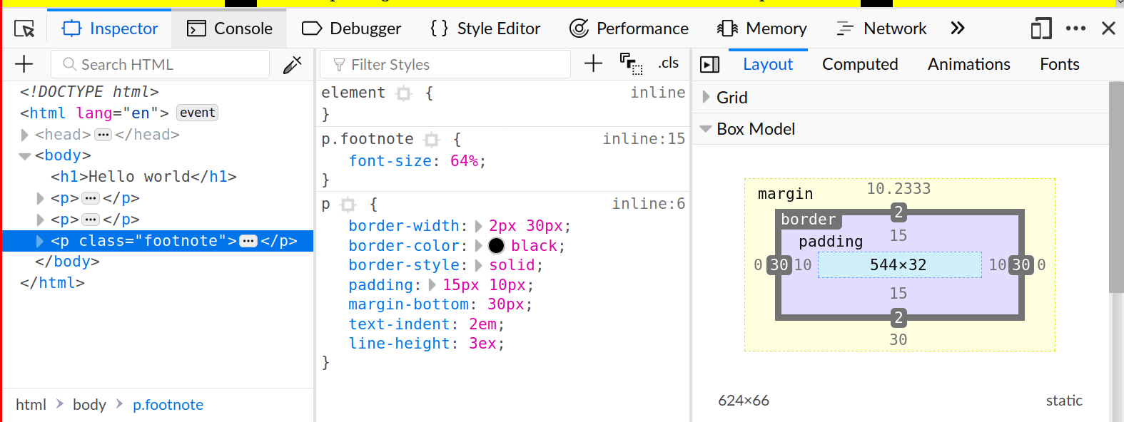
This is the inspector tab within the developer tools. There are three panels. The left panel is showing the HTML document tree. You can expand and collapse different elements, and as you navigate and hover, the corresponding elements on the page are highlighted.
The middle panel shows the CSS rules that apply to the selected
element. They could come from <style> blocks (that’s what inline
means, along with the line number), or from files included with
<link>. They are shown in order of precedence. There may also be
annotations in that panel when a rule is malformed for some reason, or
when it is unused because it has been superseded by a higher-priority
rule.
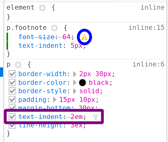
(In the image, I’ve added a text-indent to p.footnote, so that
supersedes text-indent in p. The font-size in p.footnote is
malformed because I’ve omitted the units on that measurement.)
You can experiment with different properties in this panel and see live updates to the page. For example, the checkboxes enable or disable particular properties. All the pink values can be edited inline. And pressing enter in a particular section allows you to insert a new property. Once you’re happy with edits, you can right-click to copy the modified CSS code, and paste it into your file.
The right panel can show several things, but we have the Layout tab selected for now. It shows the box model, including the actual measurements of all parts in terms of pixels. You can also select and edit those measurements.
6 Demo page
This is the content I was working on class, that uses the above CSS techniques.
<!DOCTYPE HTML>
<html lang="en">
  <head>
    <title>Hello world</title>
    <style>
      body {
          background: yellow;
          margin: 0 20%;
      }
      p {
          border-width: 2px 30px;
          border-color: black;
          border-style: solid;
          padding: 15px 10px;
          margin-bottom: 30px;
          text-indent: 2em;
          line-height: 3ex;
      }
      p.footnote {
          font-size: 64%
      }
    </style>
  </head>
  <h1>Hello world</h1>
  <p>
    Testing my page. Etiam vel neque nec dui dignissim bibendum.
    Nunc eleifend leo vitae magna. Donec at pede. Phasellus at dui
    in ligula mollis ultricies.
  </p>
  <p>
    Fusce sagittis, libero non molestie mollis, magna orci
    ultrices dolor, at vulputate neque nulla lacinia eros. Nunc
    aliquet, augue nec adipiscing interdum, lacus tellus malesuada
    massa, quis varius mi purus non odio. Proin neque massa,
    cursus ut, gravida ut, lobortis eget, lacus. Etiam vel neque
    nec dui dignissim bibendum. Mauris ac felis vel velit
    tristique imperdiet. Etiam laoreet quam sed arcu.
  </p>
  <p class="footnote">
    Testing my page. Etiam vel neque nec dui dignissim bibendum.
    Nunc eleifend leo vitae magna. Donec at pede. Phasellus at dui
    in ligula mollis ultricies.
  </p>
</html>
✓ valid HTML

8 Fonts
TODO
9 CSS selectors
- Selectors are the part outside the curly braces in CSS.
- Selectors can be tag names:
h1,p,body,pre - Selectors can reference ID names:
#sidebar,#content - Selectors can reference class names:
.alert,.warning,.aside - Can combine these:
h1#sidebar.alertwhich must match on name, ID, and class. - Can reference nested tags:
#sidebar pmatches a paragraph tag nested somewhere within a tag carryingid="sidebar". - Can require nested tag to be an immediate child:
#sidebar > p. - Can specify an “OR” with comma:
#sidebar, p - Flukeout, an exercise in specifying selectors
- Rules have a priority mechanism for resolving conflicting
properties. Generally speaking, more specific selectors produce
higher priorities.
<style>
  p { background: #cec; } /* green */
  p#intro { background: #ecc; } /* red */
  p.explain { background: #cce; } /* blue */
</style>
<p>Hello</p>
<p id="intro">Intro only</p>
<p class="explain">Explain only</p>
<p id="intro" class="explain">Both intro and explain</p>
